October 14, 2022
THE GOLDEN RATIO IN DESIGN
Part 3 in a series
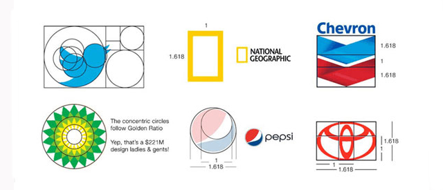
With the studio’s October 2022 email, we looked at how the Golden Ratio existed in not only nature, but in art and architecture. Graphic art and logo design is greatly influenced by the use of the Golden Ratio as well. Professional design takes it one step further and makes use of circles that are sized within the Golden Ratio as well.
Some of the most recognizable brand logos were built using the Golde Ratio
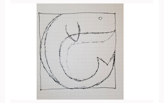
Now let’s apply the Golden Ratio in the build of a logo project at the studio. In the interests of full disclosure, here is your spoiler alert: I am the worst at sketching designs. I see these designs in my mind, however, I am constitutionally incapable of transmitting the art that flourishes in my brain down to the pen or pencil in my hand. Thankfully, I can convert poor sketches back into that which my mind sees.
The task is to create a nautical theme logo for a hotel bar. While a seahorse is my usual go-to for oceanic art, I thought it would be fun to use the Blue Whale for this project.
Step one is to scan the sketch into illustration software and place it on its own layer.
Afterward, create a separate layer in the software to house the Golden Ratio circles that will be used to build the icon of the whale.
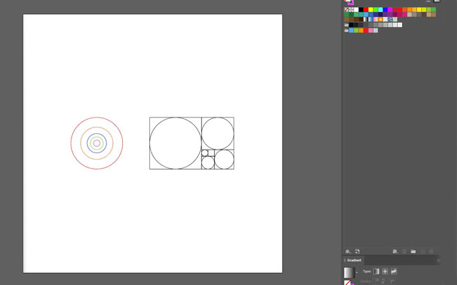
Now comes the work of arranging and combining circles until a whale outline begins to form.
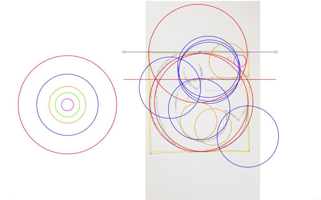
Using the software, you combine the overlapping parts of the circle that represent the whale form and discard the unused parts. Now you start to see the form of the whale with greater clarity.
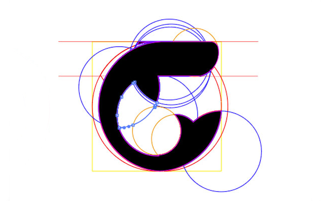
Next we add some color and other small design elements.
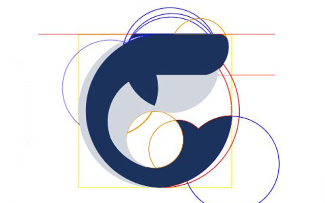
Lastly, we add the type for the hotel bar name. Notice that the height of the font must also respect the proportion of the Golden Ratio. This is better seen with the letter “w” against the white circle in the back.
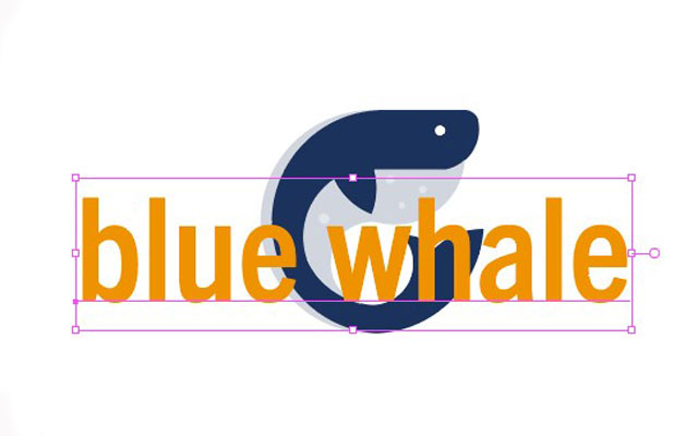
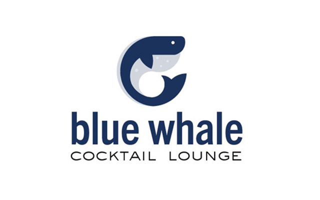
Below is the finished project art.
If you are interested in professional illustration design for your organization’s projects, contact FIVE today today!