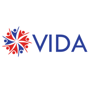
Recently, a new website client presented their logo for use in the site. The owner wanted to “spruce up the logo” and mentioned he purchased the artwork via a website service that provides various logo options for potential purchase.
On first glance, it appears to be a nice, balanced logo. Upon further inspection of the art files, it appears that the graphics would have benefitted from some attention to detail by the original creator. Additionally, the owner stated that the nonprofit organization would be reaching out to not only to the communities close to the Mexico border, but across the border as well. It was recommended to the owner that the logo be adjusted for artwork cleanup and potentially a color change.
Let’s look at the situation.

1. Element spacing in the graphic element
The icons representing people are laid out in a spoke style. A second look at the layout shows that the elements are not evenly spaced. This should be evenly spaced.
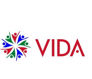
As you will see in the image used for topic #3 below, the freshly re-spaced graphic looks balanced. As an added bonus, now the negative space between the icons displays a multi-point star or floral element, depending on how you perceive the graphic.
2. Stray points in the graphic elements
In small scale, one could probably get away with using the existing logo, however today’s event marketing would likely see the original artwork issues when enlarged for use in street posters as well as step and repeat backdrops. The stray points of the vector drawing would need cleanup.

3. Color palette
The current logo boasts the use of American patriotic colors of red and blue. If the focus of this particular nonprofit were to provide service to only the citizens of the United States, then existing colors would be sufficient. Given the reach across the border, it would be advantageous to present a collaborative color wheel to show some outreach to the Mexican citizens and their particular patriotic colors. Adding some green to the logo would achieve that.
The existing shades of red and blue were modified to brighter shades in order to provide a bit more punch and to harmonize with the new green.
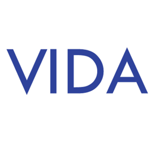
4. Spacing of the type characters in the typeface
Similar to the stray points in the graphic elements, the existing logo probably would have been sufficient in small scale. Upon enlargement, one would probably notice the uneven spacing between the type characters. Take note that the letter “i” was encroaching a bit upon the personal space of the letter “v.” Meanwhile, the letters “d” and “a” seemed a bit estranged.
A dose of realignment would alleviate this situation for large scale use.
5. Connection between typeface and graphic element
On their own, the graphic and the typeface are fine elements. However, when positioned next to each other, there seemed to be a bit of a disconnect between these two as well as the overall combination not promoting a progressive new nonprofit organization. There needed to be some visual connection to unify. Dispensing the use of the traditional “a” character, inverting a copy of the “v” character graduated the typeface to a contemporary presentation; almost too much. This was not a space age nonprofit. So to tone down the ultra contemporary “a” character, a copy of one of the red heads of the icons was brought over to represent the horizontal bar that comes with the traditional capital character “a” in most fonts. Suddenly, there was a contemporary look to the typeface and a visual connection to the graphic element. To add a bit more impact, the typeface was changed to red.
Epilogue
Looking at another graphic artist’s logo is infinitely easier to do than looking at one’s own creations. I’m guilty of this sin myself. Over the years, I’ve learned that where possible, have a studio or agency colleague review your artwork and ask for a visual analysis. It only takes a moment of their time and provides valuable feedback. This feedback is critical to not only your success, but the success of your client’s identity. With a few recommended modifications from your trusted industry contemporary, your latest logo effort can be a genuine success story for everyone!
Leave A Comment